Brand Development
Case Study
Acushnet Federal Credit Union

Logo Design
Local credit unions are all about neighbors coming together to help neighbors. The logo design features a collection of people with their arms outstretched brought together to form the shape of a compass. The compass is emblematic of the area’s rich maritime history as well as an homage to the word “Acushnet” which is a Wampanoag word meaning river’s end. The compass points to a star, representing the end of the river.
Print Collateral
We designed all of the initial print collateral such as their business cards and rack cards.
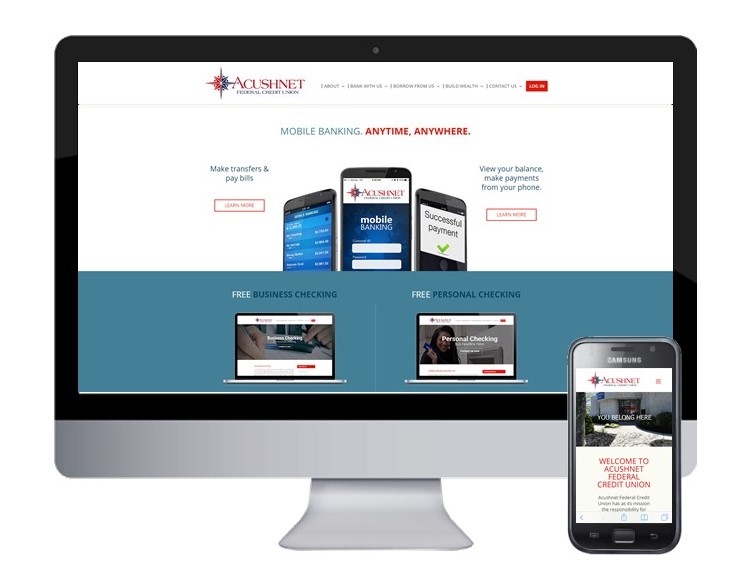
Website Design